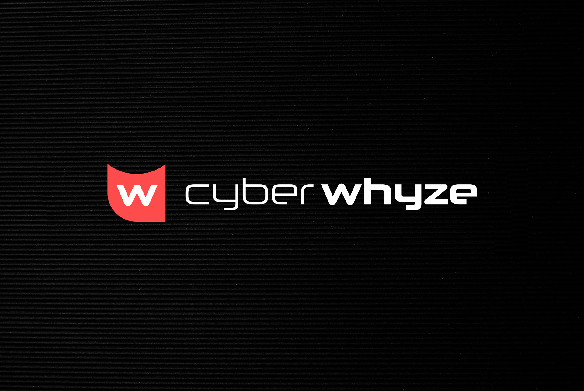
E Graphics LLC was hired by a cybersecurity content marketing agency, cyberwhyze, to assist as a designer and art director for many design projects ranging from ebooks and blogs, to pop-up banners and landing pages.
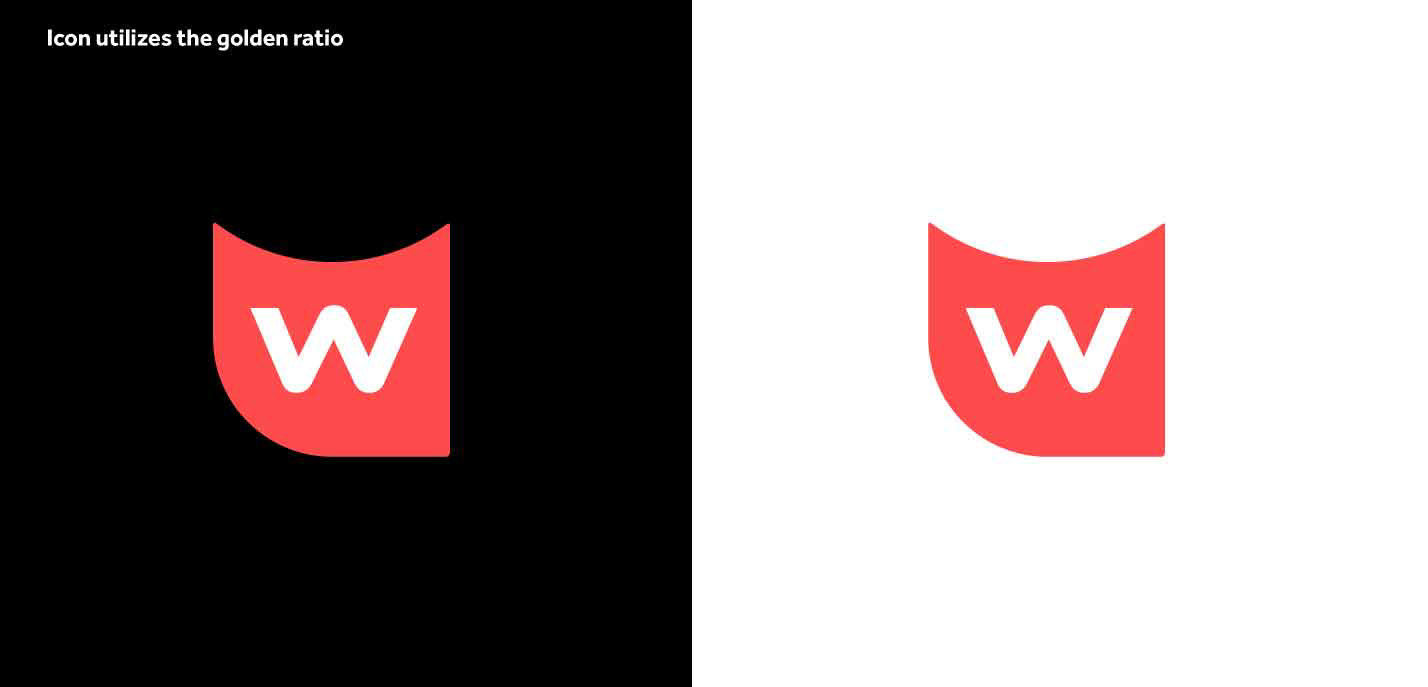
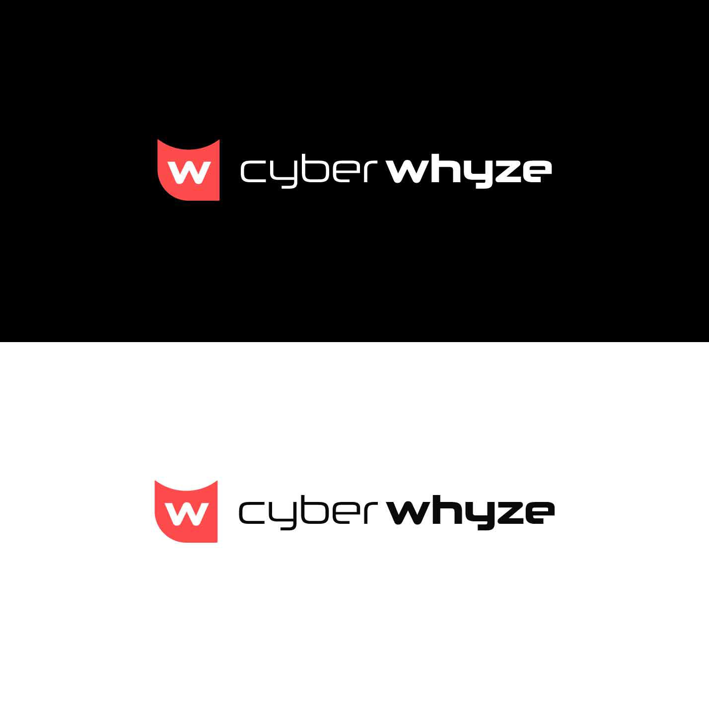
Highlighted here is their fresh logo redesign incorporating the golden ratio that can be seen on their landing page (which E Graphics LLC also helped with): View Cyberwhyze Here. Their original logo had a red, abstracted owl shape, so it was updated with a modern, golden ratio solution. The logo symbolizes futurism, modernism, cybersecurity, power, and fearlessness. Red was the original brand color, and it was kept due to its psychology of passion, energy, and action.
Some of cyberwhyze's clients that E Graphics LLC supported design projects for include:
Lenovo (OEM Solutions & ThinkEdge), Logistiq, BeGreenLegal, Infinite Prime, and Belwood Investments.