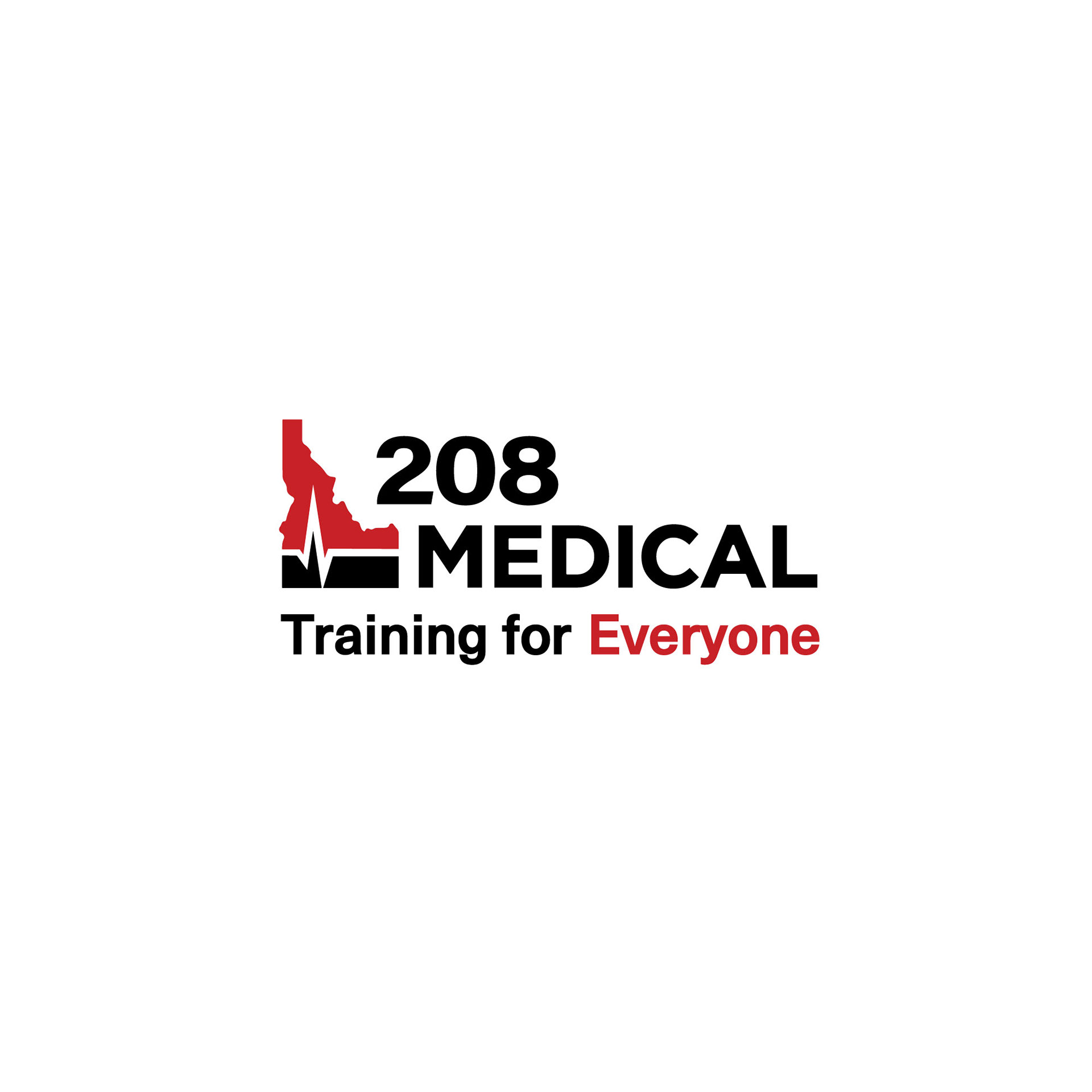
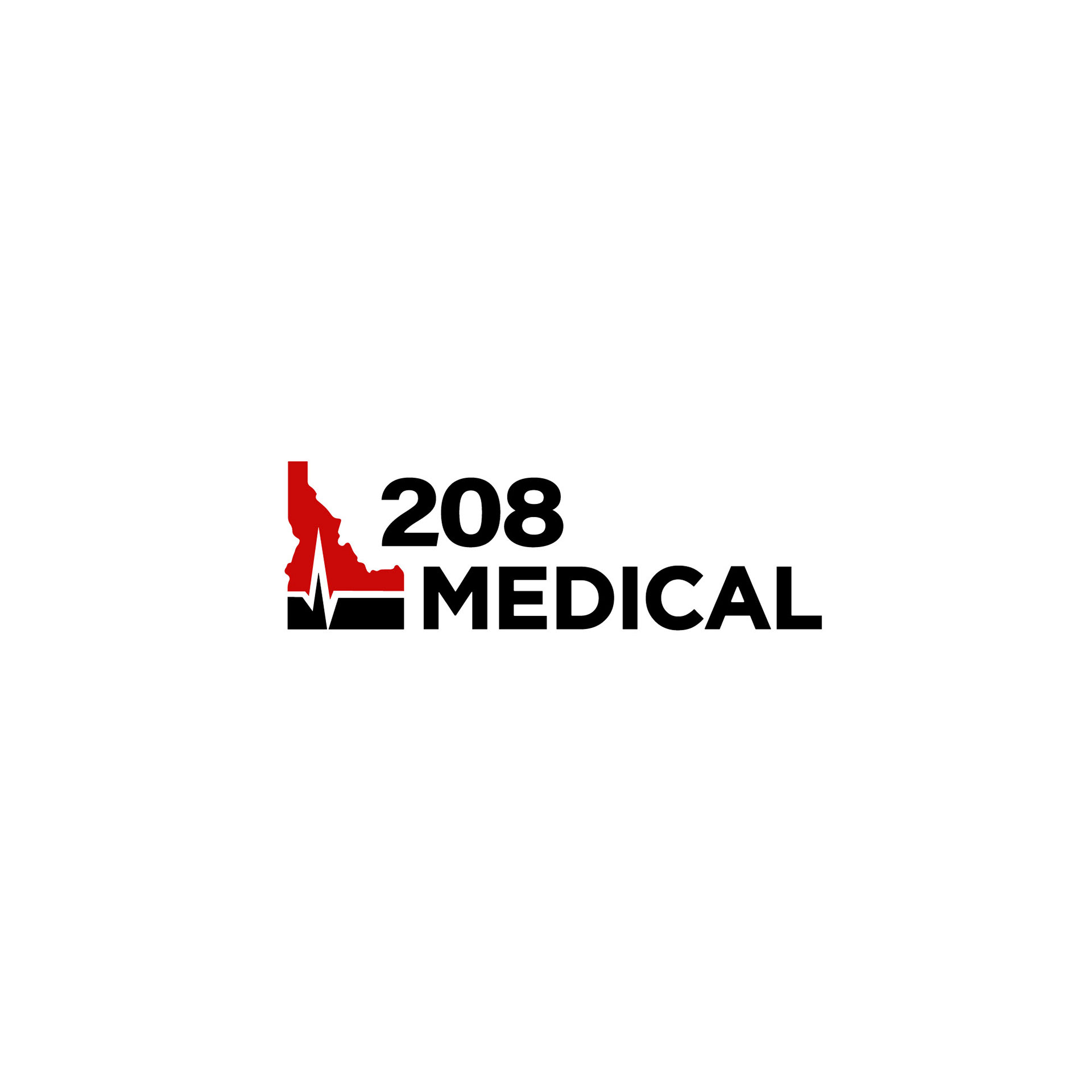
Owners Ryan Daly and Jesse Acheson reached out to E Graphics requesting a new logo design for their business partnership, 208 Medical, that provides CPR and First Aid training for everyone.
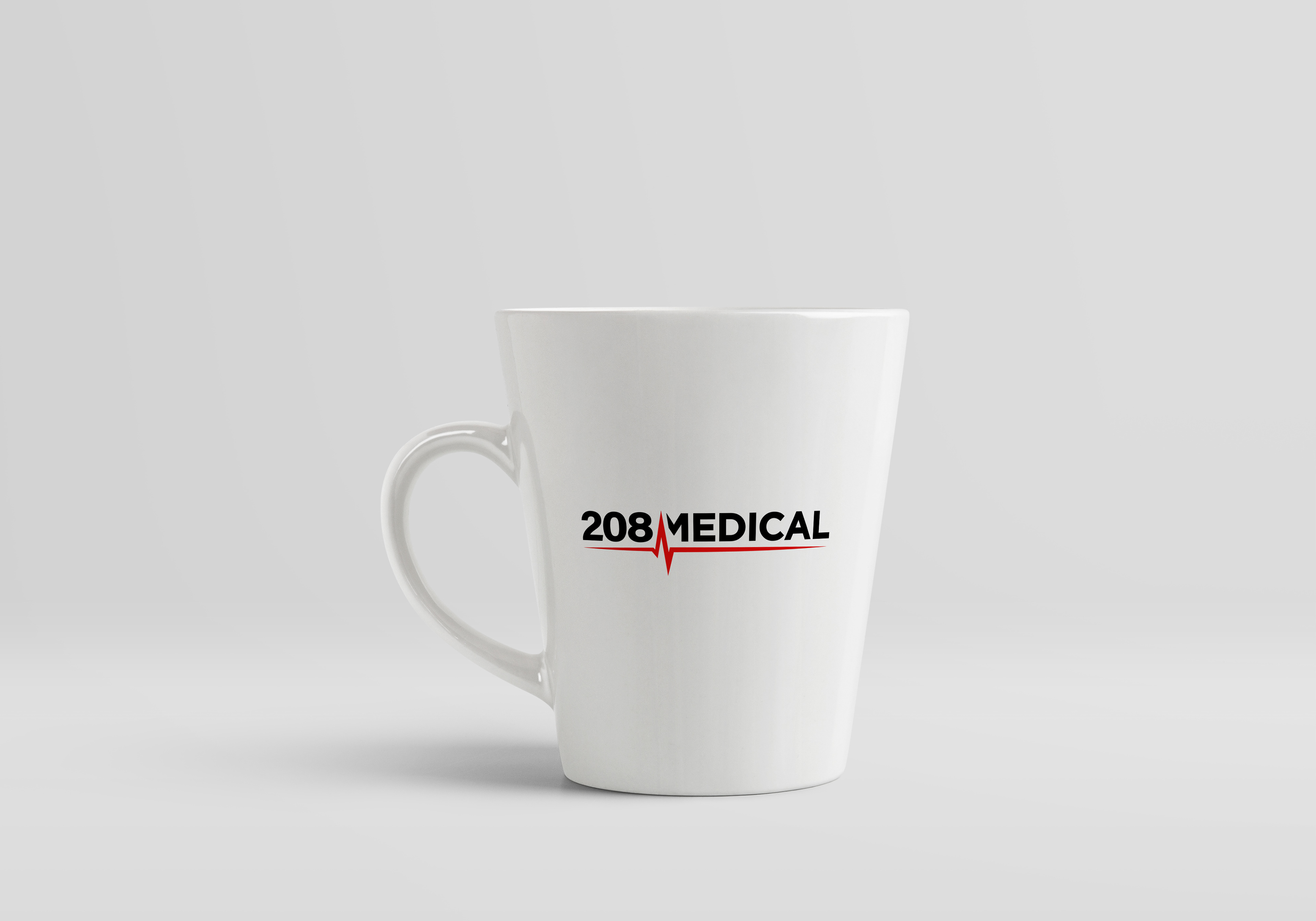
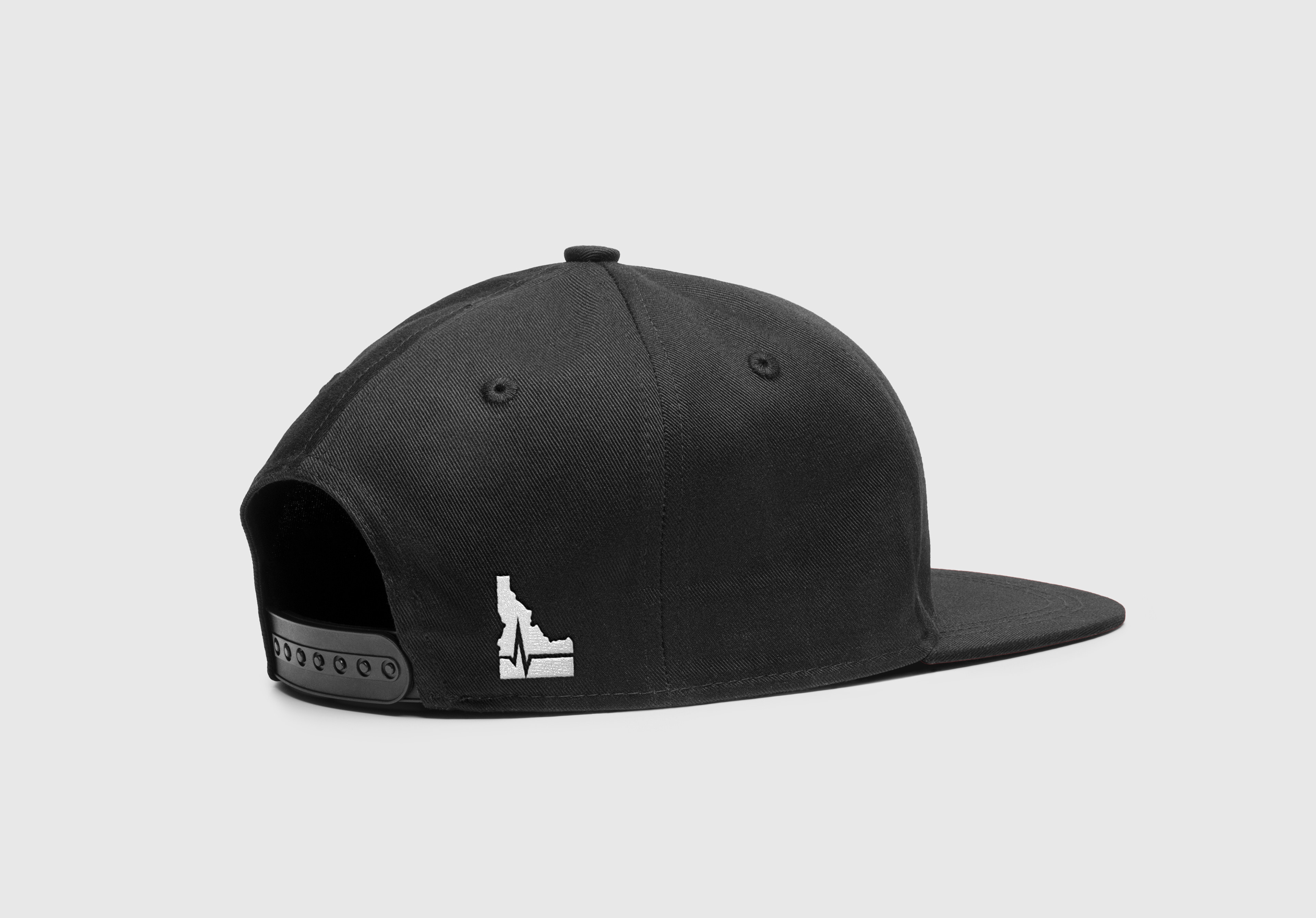
Located in Idaho and with a history in the medical field, both Ryan and Jesse decided that medical education needed to be more accessible to everyone interested in learning how to save a life. Since E Graphics helped with their logo, 208 Medical has requested further design assistance with banners, logo variations, website assets, and more. Their popularity is growing, with raving reviews from the community!
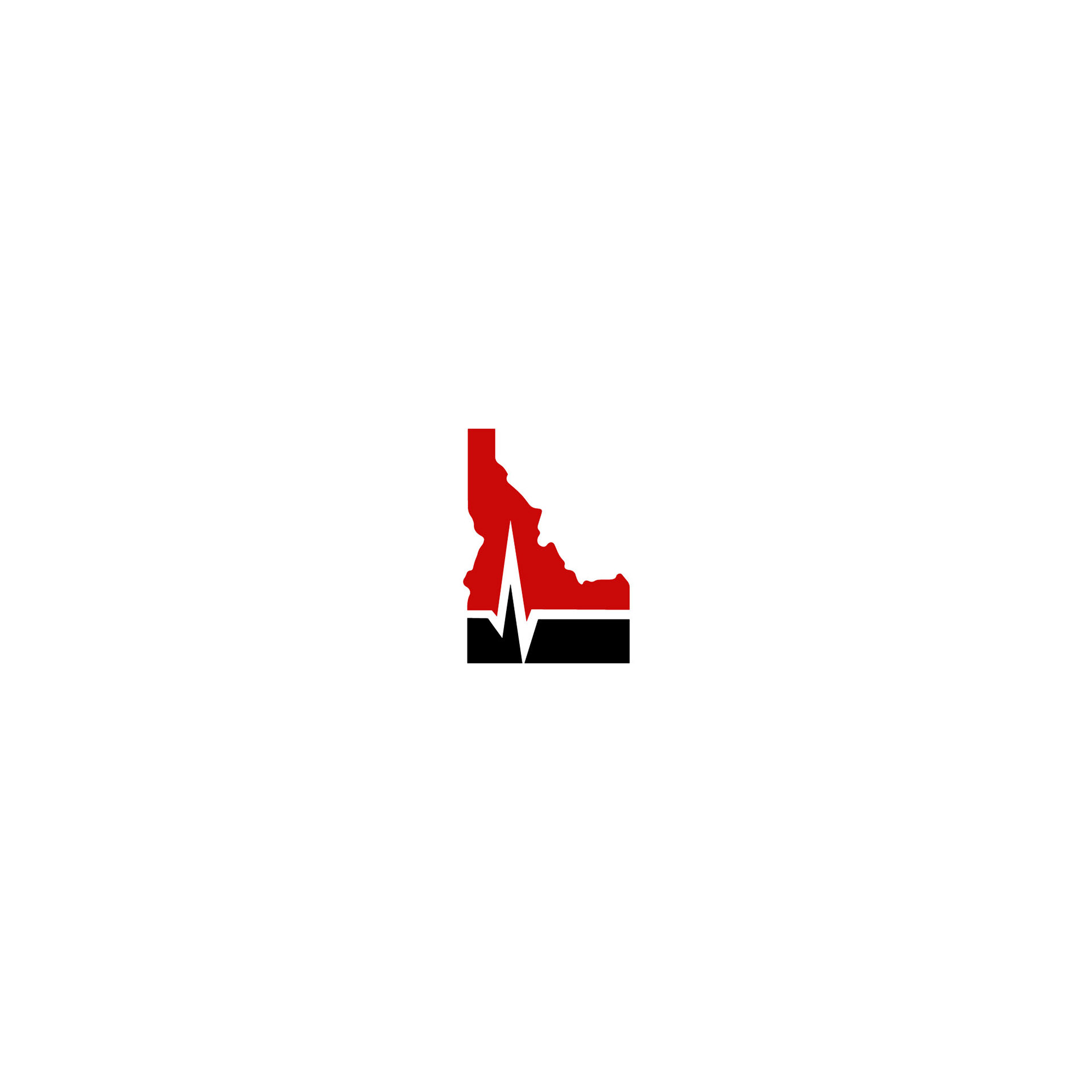
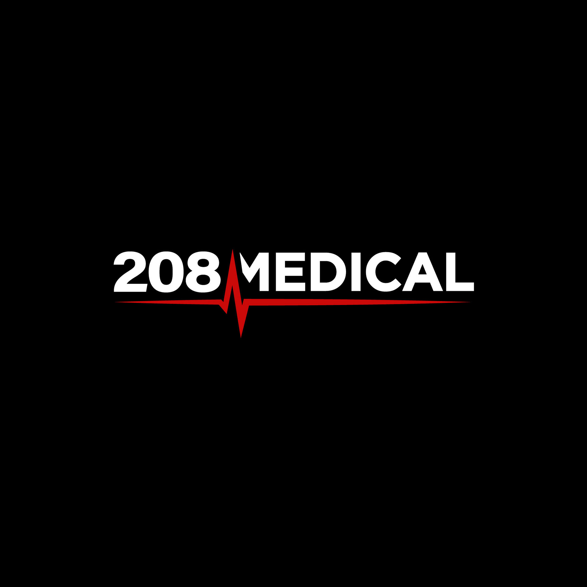
During the design process, Ryan and Jesse wanted to stay away from common competitor color palettes, and gravitated towards red and black. Incorporating the state of Idaho was very important to them. The final logo showcases a heartbeat, state of Idaho, urgency, structure, and training.
You can book a class here on their website at: 208medical.org.